Reviewing tools for collaborative practices and version control for designers, this is episode III. And to my surprise, I’ve discovered Pixelapse, an online tool that promises to do just that.
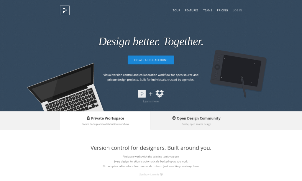
It’s been a while since I had found about Pixelapse, but never took the chance to study it deeper until last week. Mainly because they require to install some software that only works for Mac and Windows. And since I use Linux, well…
So I borrowed a Mac without much luck either. Pixelapse software requires Mac OSX 10.7 and higher. The Mac was running on 10.6. I know designers have usually high end machines with latest software installed. But no Linux support and only a recent OSX, that’s 2 wall hits for me before even starting. But anyway, solved this by installing a Ms Windows running in a Virtual Machine under Linux because I really wanted to see how their tool worked. A pretty big setup just to sync files and not practical in the long term, but for the love of testing, it was fun enough.
Basically, what you are installing is a synchronizing software. Just like Dropbox, it creates a special folder on your machine, where you will keep your files synchronized with their servers and with the other computers you share that folder with. The other computers could be yours or from the designers that you want to work with. Apart from that, all the features proposed by Pixelapse run in the browser. Well, not every browser. Seems they only fully support Chrome. Internet Explorer is a no go and I don’t blame them for that (I tested IE11 only). Firefox seems to work ok, except for the “image inspector”, and that’s a pretty big feature being broken for no apparent reason.
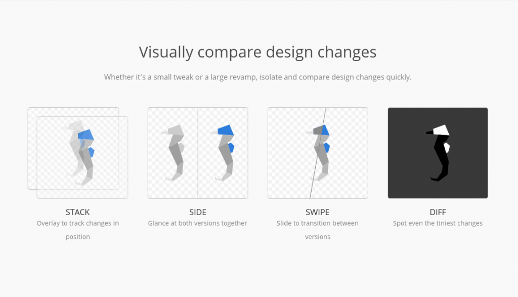
About the features, they have really though it through. You can see their service as being between a version control, a project management and a reviewing tool. You can define roles for each projects, invite “clients” to review your graphic files and comment on them, or have collaborators with {full|limited} permissions. They support a wide variety of file formats for preview (mostly Adobe stuff), but also open file formats and even .xcf (Gimp files), although the latter did not render text properly. Version control is basic (no concurrent versions and they don’t allow custom naming your versions, so you’re stuck with version1,2,3,…) but at least they allow you to rename and move files around without losing their history and you can flag “milestones” in your project’s history. They also allow you to visually compare files or file versions in different ways. Commenting and reviewing design seems pretty well made, Although I could not test it on an actual project or with a team as I don’t know anyone who’s using this tool.
So my overall feeling is very positive, but something is bothering me. Apart from the fact that it’s not open source, not working on all systems and that you have to trust them with your files, why did I not hear of them more? If I had to do a comparison, I’d say this aims to be the Github for graphic designers, but why don’t I see more of us use it? As a matter of fact, I will definitely find more graphic design projects on Github than on Pixelapse. Why is that? They do allow public projects for free accounts. They encourage in their communication to do open source design projects. They feature some on their homepage. But after going through what was available publicly, I did not see much collaboration going on (Googling through the website, I found one public project with 8 participants. But can’t figure out if there was any collaboration at all. And then this UFO, which seems to put to good use the features proposed, but I’m wondering if this was really meant to be public). I know it’s a young service (2 yo), but Internet is pretty quick to embrace a pretty good idea when it sees one. Where is it not catching up?
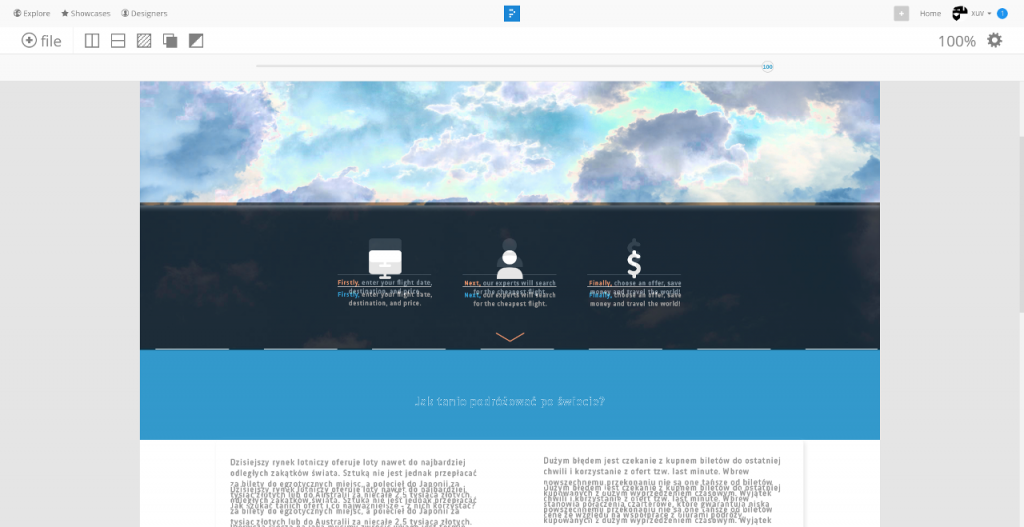
I don’t have a definitive answer, but my feeling is that the interactivity is a little oversold and that it unfortunately still enforces the digital divide between coders and designers.
This tool is for graphic designers only, coders will not feel at home. Yes they support the viewing of some code files (HTML, CSS, JS), but without line numbering and a basic text diff tool, this is useless, even scary. Also, why not support other languages like, Ruby, Python or Bash scripting? Where is the problem with that? There are some good ideas : like having a README.md file and a cover image at the root of your project to automatically create a nice presentation page for your public projects. But then, without a proper way to see what changed in your markdown syntax, this becomes a little awkward to use.
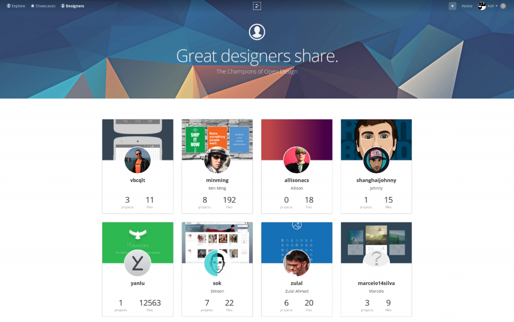
The navigation has problems also. Exploring public projects is a pain. There is no search bar. You can add tags to your project’s description, but it’s like they forgot to implement it on the backend. No way to browse based on project type or keywords. No way to see the latest activity on the site resulting in no sense of community. Seeing the public projects they feature, it feels more like Behance − or any portfolio you can name − than an “Open Design Movement”, as they want to call it.
The interface is also a drag sometimes. It’s using animations here and there and this makes it all a bit clumsy. I want my tool to be fast and to the point. Animating between a thumbnail view and a list view of my files is not something I find important or informative. I wish also that space would be used more efficiently. The whole window is used when previewing files, comparing and reviewing them. And this is a good thing. But why do I feel that so much space is lost when I’m navigating folders and projects. Why not have the full screen used also for that too? I also found myself clicking a lot − where there was no button − expecting something to happen. At other times, I was completely lost and had to go back to the main page to start again.
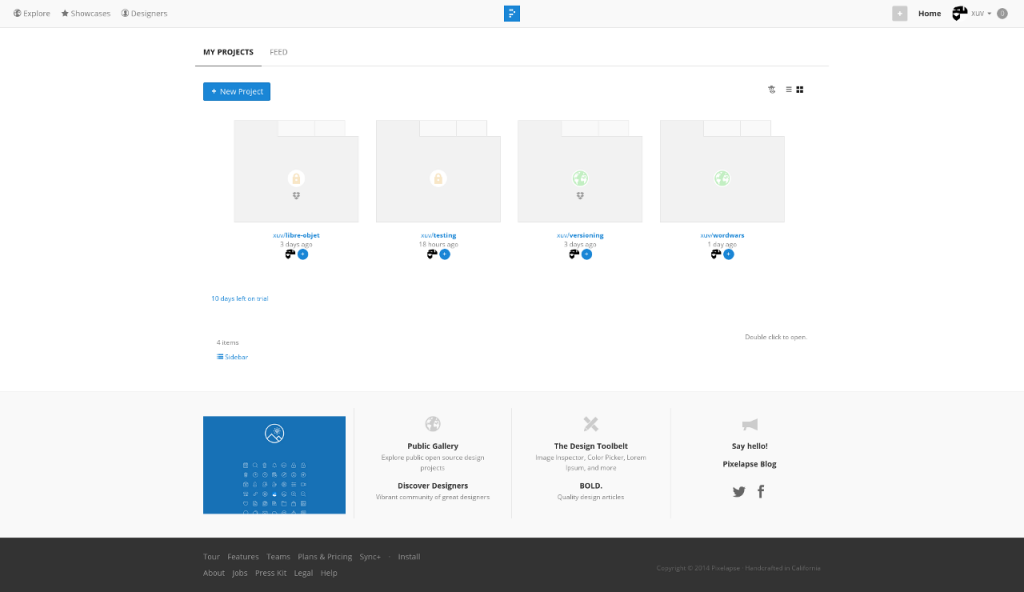
Maybe it also tries to embrace to much. Working with clients is not the same as working within a “private” team and not close to working with strangers on open source projects. Keeping designers distant from coders is a also counter productive approach in my opinion.
The good news (or the bad news, depends on the point of view, I guess), is that Pixelapse has just been acquired by Dropbox. So it could mean that Dropbox will improve or that Pixelapse will support more operating systems. I’m guessing Dropbox is interested in the visual reviewing tools since they’ve just started introducing a commenting system for their files. As for the future of Pixelapse, Here’s what they have to say about it:
Will Pixelapse continue to operate?
Pixelapse as a standalone product will continue to be available and supported for the next year as we work towards bringing the same kinds of collaboration and workflow experiences that you’re used to in Pixelapse over to the core Dropbox product.
That just sounds to me as “good bye and thanks for all the fish”. I don’t expect Pixelapse being updated for the next year and have not seen a post on their blog or twitter since the Dropbox announcement (and that was 6 months ago).
There is a ton of good ideas in Pixelapse. But it needs polishing and a different approach regarding their community if they really want to be the repository platform of the “open design movement”. So for me, I’ll just pass and move on.